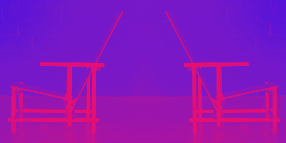
16th appointment with the Design Icon of the Week dedicated to the icon of icons: the Red & Blue by Gerrit Rietveld.
Fifteen strips in beech wood, two plywood boards, the three primary colors and black. These are the ingredients used to create one of the most iconic pieces of all time: the famous Red and Blue Chair by Rietveld.
To see it looks like the three-dimensional representation of a work by Piet Mondrian, not for nothing has become the manifesto of the De Stijl movement.
The son of a carpenter, Gerrit Rietveld soon approached his father’s profession. Still young and inexperienced, he experimented in the field of furniture design, making a clean sweep of the past: he was looking for new modes of expression, new forms.

Rietveld’s research tends to abstraction, to the essential and will culminate with the prototype (in 1918) of what will become the “Roodblauwe Stoel”.
The first version of the chair is not colored and predates the fateful meeting with Theo Van Doesburg and Piet Mondrian (founders of De Stijl). Just five years later, the final version will be presented, perfectly aligned with the principles of the movement. The language used is regulated by the golden norms of classical art and uses simple geometric shapes and primary colors: red, yellow and blue.
Color is the first scheme of matter according to Goethean aesthetics: yellow is the vertical movement of the sun’s rays, blue is the celestial horizon that contrasts with yellow, and red is the union of the two, which occurs at dawn and dusk.
For De Stijl, colour was a construction material, not a mere decorative element.

The various parts of the chair are assembled by simple juxtaposition and overlap without interlocking or interpenetrating in order to “connect the individual parts without mutilating them, so as to prevent one from dominating the other by covering it or putting it in a situation of dependence” as the designer himself explained.
A forerunner of functionalist theories, Rietveld was also particularly avant-garde in the distribution of his products.
The material to build the chair could easily be found on the market at low prices, the assembly was quick and simple; These factors made serial production possible on an industrial scale.
Geometric, linear, with well-balanced proportions; the “Roodblauwe Stoel” conveys a feeling of harmony overall. However, comfort cannot be counted among its main features…
A deliberate choice: Rietveld wanted to create a seat that would allow relaxation but not sleep, a session that would encourage reflection, or, as he called it, an “awakening of consciousness”.
“The purpose of this chair is to simplify the individual parts, to preserve the intrinsic form in the original character and purposes of the materials used, the same form that leads to the formation of a harmonious entity thanks to the adoption of a specific module for the various distinct elements. The structure of the chair is such that the individual parts can be connected to each other without mutilating them, so as to avoid that one dominates over the other covering it or putting it in a situation of dependence; In this way everything is free in space. The shape was born by virtue of the material. The aggregation criteria I used allow the use of wooden strips of 25×26 meters. […] The so-called red and blue chair, therefore, […] also serves to demonstrate that it is possible to create something beautiful that intervenes plastically on the space with the use of simple and pure elements produced by the machines »


